


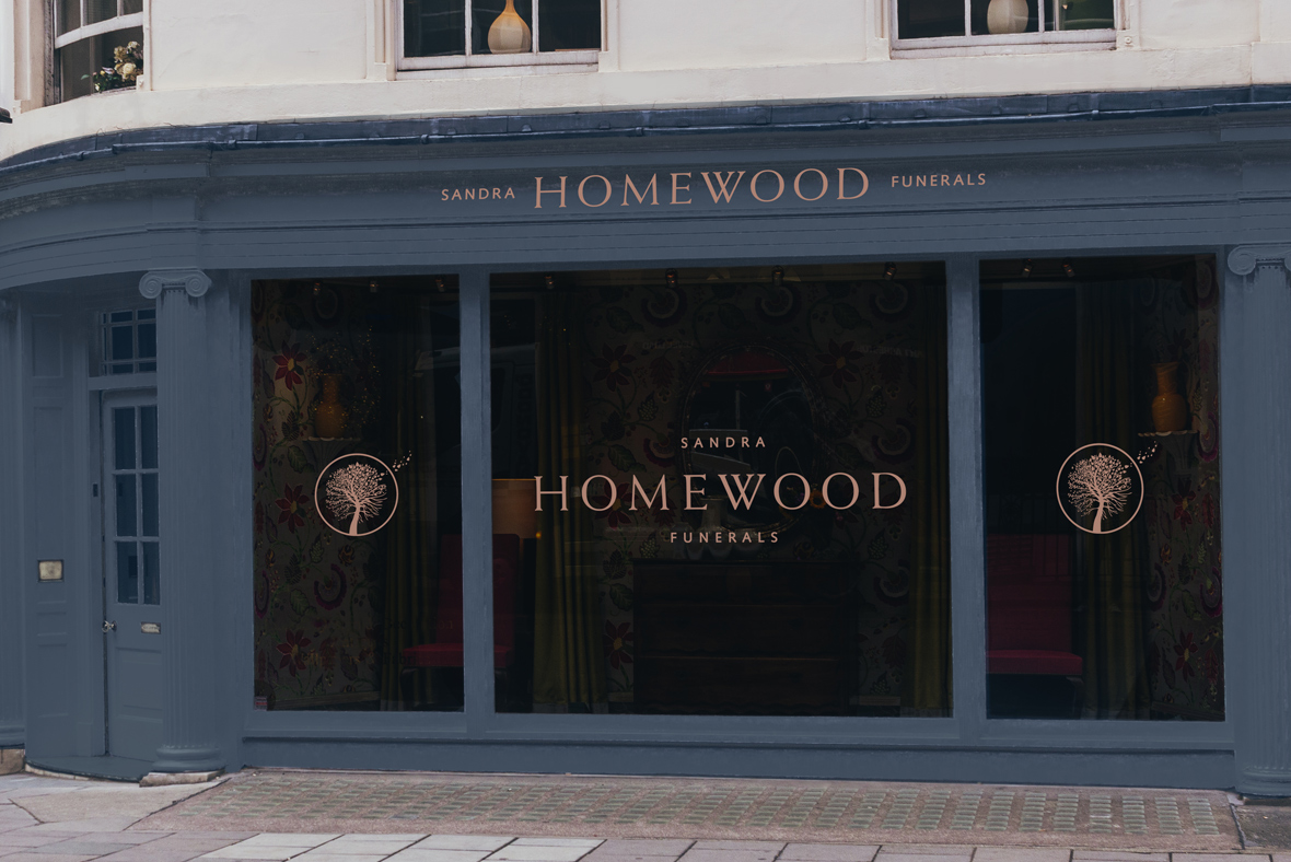
Brand identity for a new Oxfordshire-based Funeral Directors
Sandra Homewood Funerals is a family run start up business but where the directors have a proven track record in this sector within Oxfordshire. The aim is to offer a real personal service – not now offered by the majority of the competition dominated by the two large funeral conglomerates.
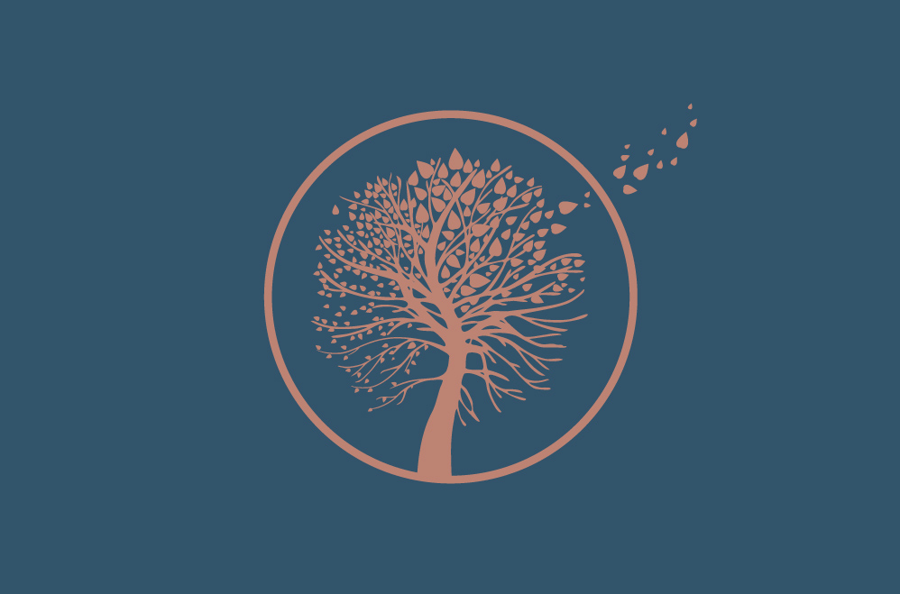
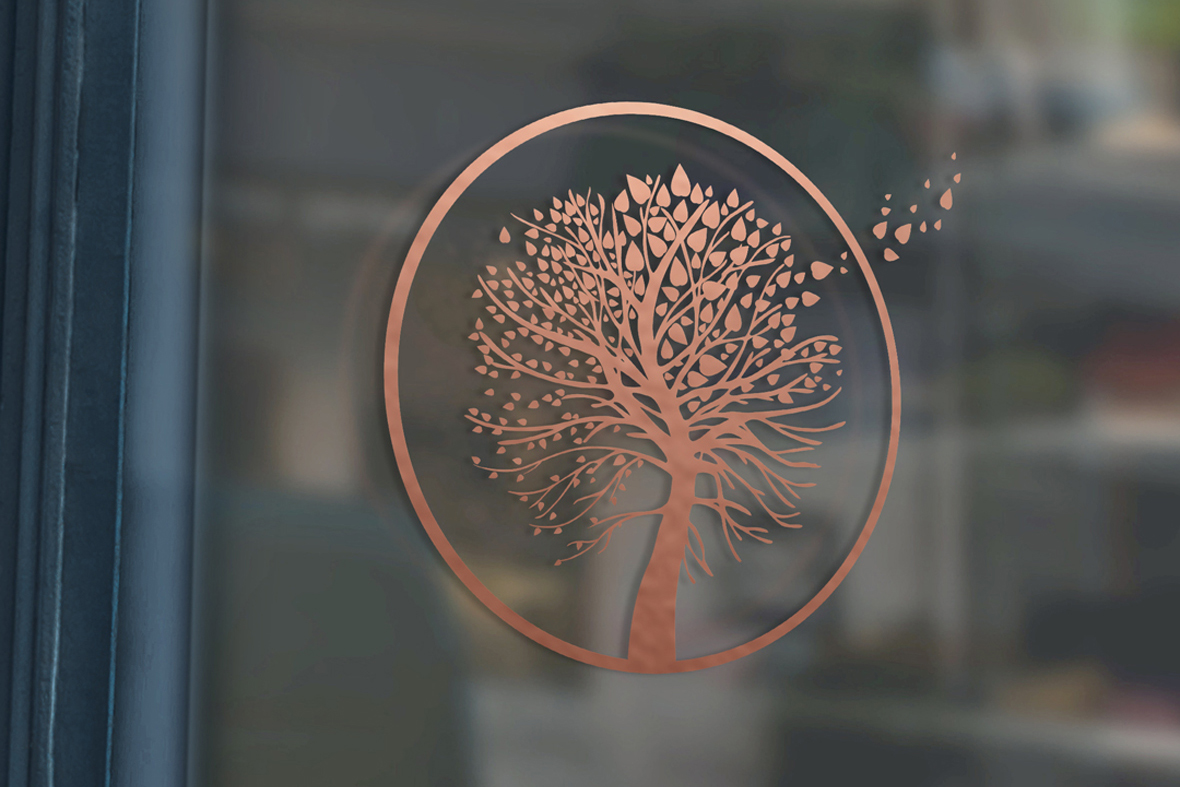
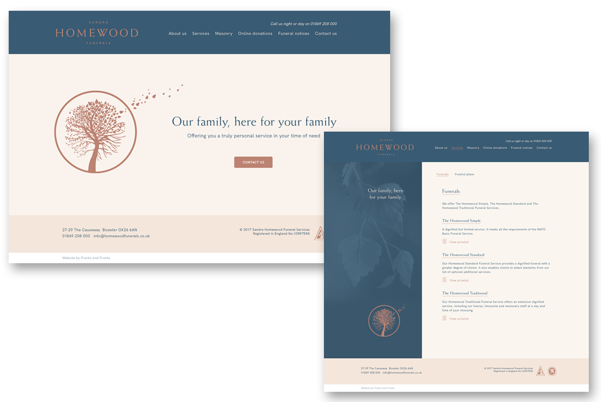
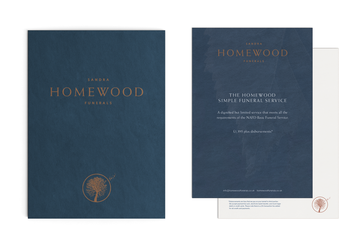
We created a logo that positively illustrates life and death by the tree of life symbol with all four seasons in one tree - an understandable and relevant metaphor. We also created a subtle moving image of the logo on the website.
The overall identity is clean and modern with a sensitive colour palette of dark grey, bronze and cream - suitable to the sector without being gloomy. This was then applied to their shop fronts, website, advertising and all print items.
“Franks and Franks immediately understood our ambition to create something modern, friendly and unique in this sector and realised it with considerable style. The resulting designs have enabled us to stand out as a fresh, welcoming and professional company, reflecting our modern and innovative approach within a very traditional industry”
Sandra R. Homewood (nee Childs), Principal and Director


Featured projects
Interested in working with us?
Then get in touch as we'd love to hear your story

Contact

01993 813705 web@franksandfranks.com
Franks + Franks, The Studio, 9 Apsley Road, Oxford, Oxfordshire, OX2 7QX
