


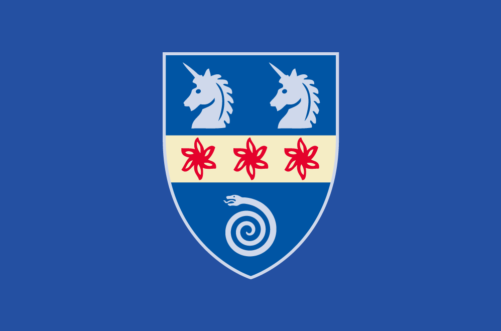


Hertford College, Oxford
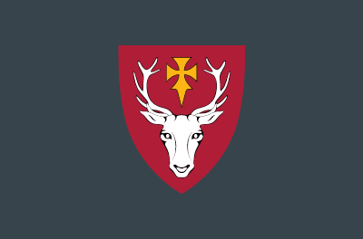
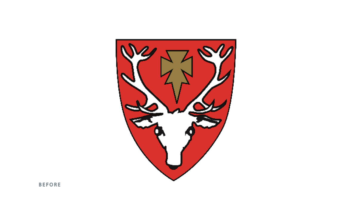
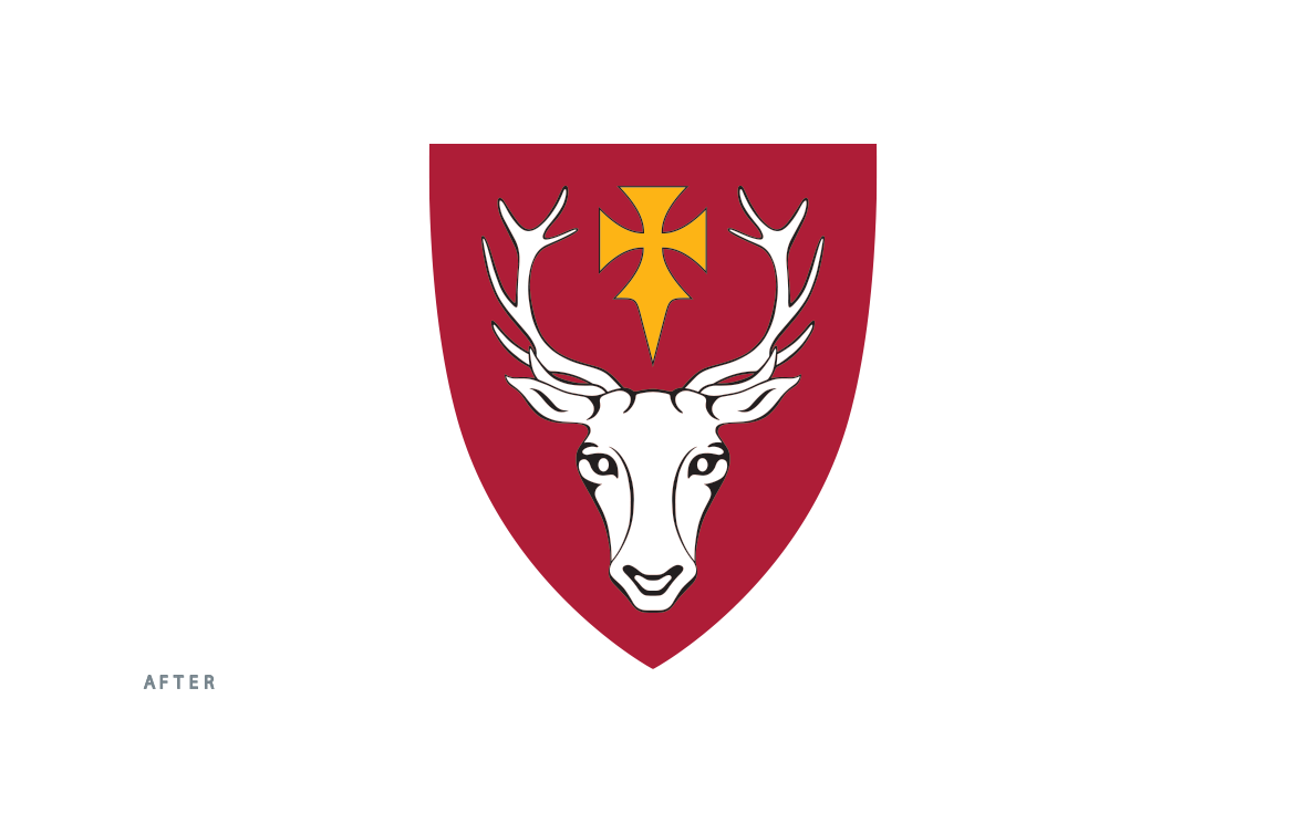
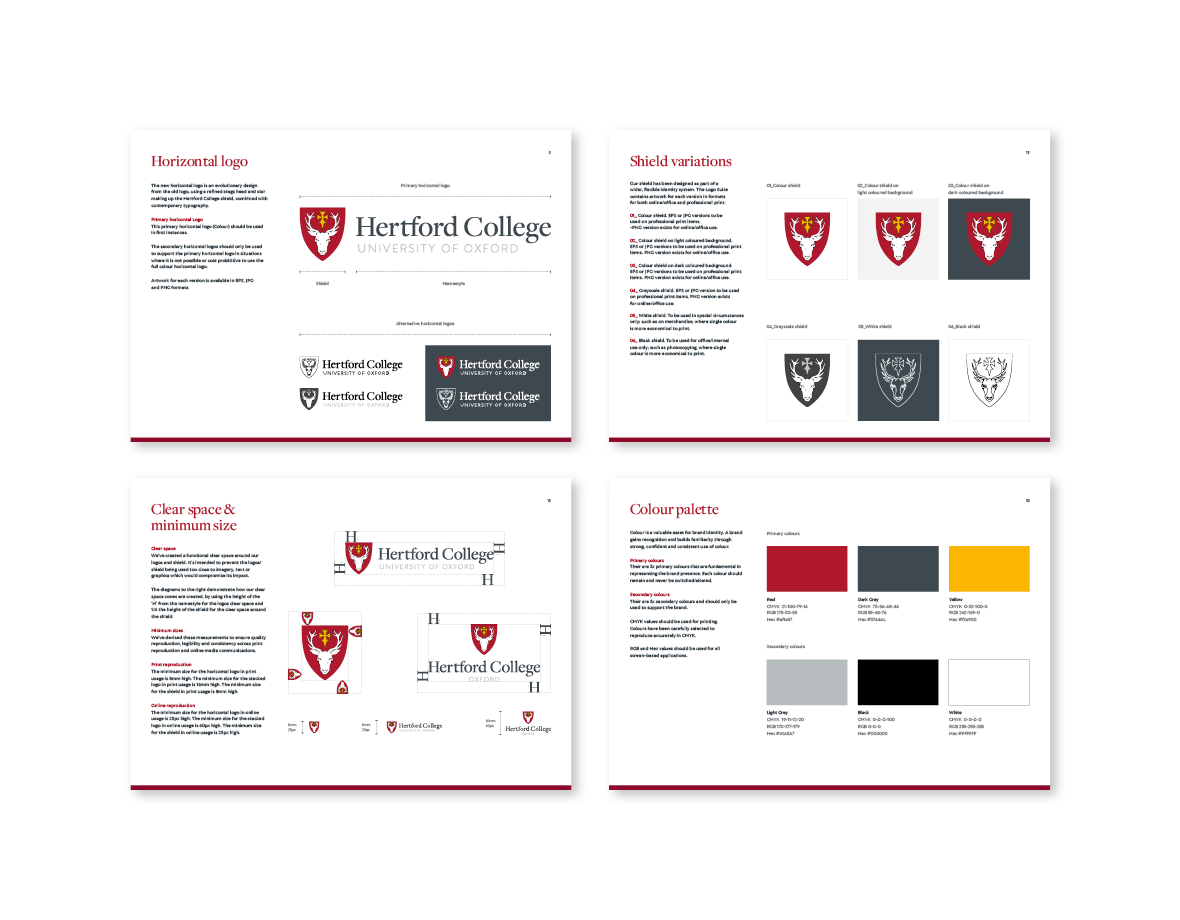
The new logo for Hertford College included redrawing the hart symbol, updating the colours and designing a new namestyle, all together forming a modern logo whilst holding on to tradition.
We went back through their archives and discovered many different versions of the Hart’s head. One detailed engraving of the hart became the basis for the new symbol. Along with our newly finessed drawing, we also made the red of the shield darker and added a dark grey for the namestyle. These colours form the colour palette for the identity. For the namestyle we chose a serif font, Freight.
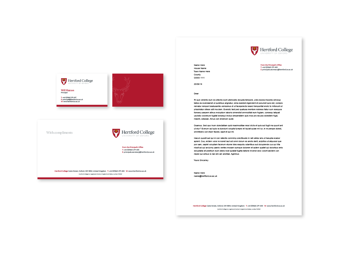
The logo is therefore a combination of a traditional shield that is authentic to their past and the namestyle that although uses a serif font, is newly designed and has a modern kick to it. The logo is being implemented consistently across all communication items and the physical environment; signs, clothing, etc from the set of guidelines we have designed.
The website adopts the use of Freight for the headings along with a sans font, Autor, for the text. The colours from the logo - the dark red and grey were consistently applied throughout the site. But a variety of page designs were created along with a set of bespoke infographics using a secondary colour palette which creates pace and interest to the site.
The navigation was pared down to the fewest headings we could achieve - making it easier for the user to find what they need. New photography was commissioned to add life and a contemporary feel. All copy was rewritten to create a warm and welcoming, accessible site.


Featured projects
Interested in working with us?
Then get in touch as we'd love to hear your story

Contact

01993 813705 web@franksandfranks.com
Franks + Franks, The Studio, 9 Apsley Road, Oxford, Oxfordshire, OX2 7QX
