


d'Overbroeck's
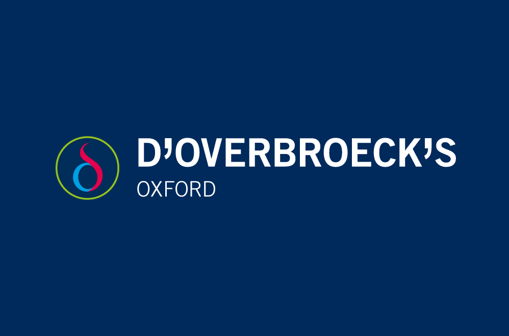
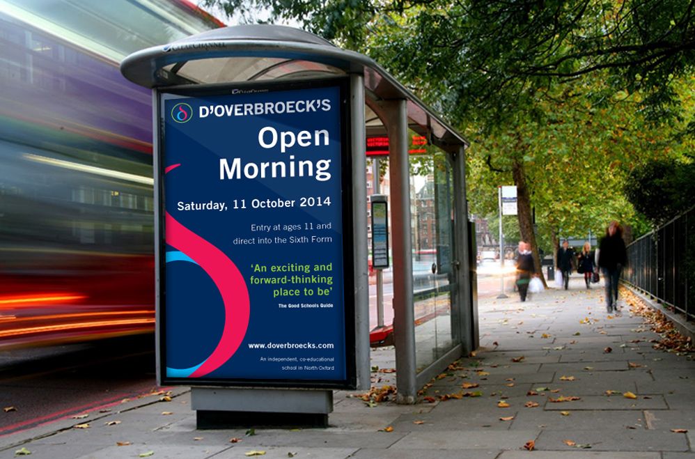
Their communication material was well done - with the use of a simple bold namestyle and typography on dark blue – but was a bit stark and lacked excitement. Adding the symbol to the existing namestyle and collateral was our solution to help bring their identity to life.
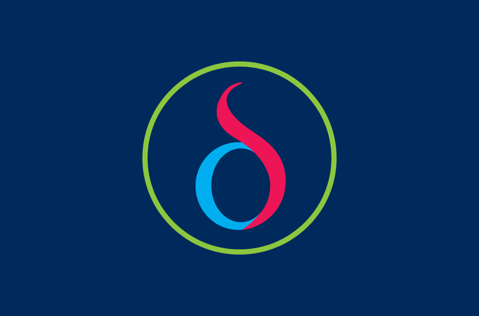
The symbol is based on the Greek Delta symbol. This uses the letter D as the first letter of the long name - but also communicates a sense of academia. In addition, the Delta symbol is constructed with two colours and is within a third coloured circle – giving the 3 parts of the school a colour: Years 7-11, Sixth Form and International Students. The colours and symbol adds a spark and strength to their material.
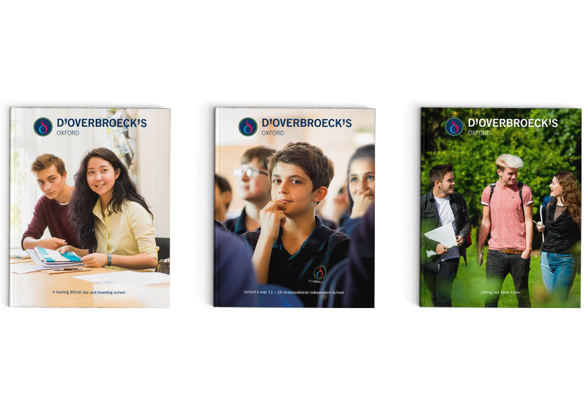
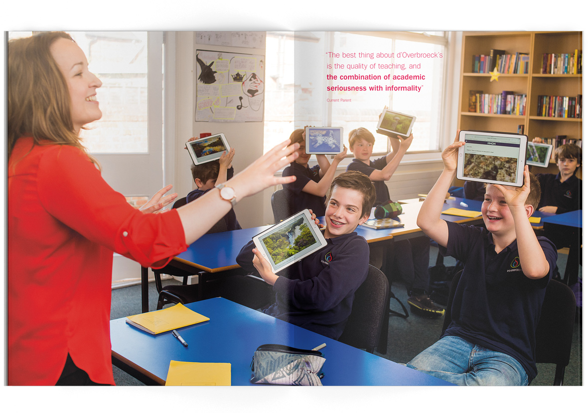
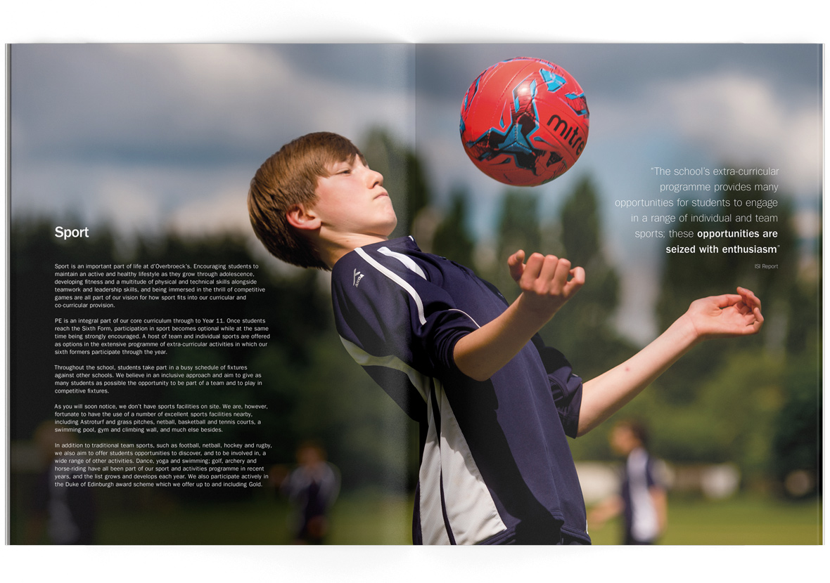
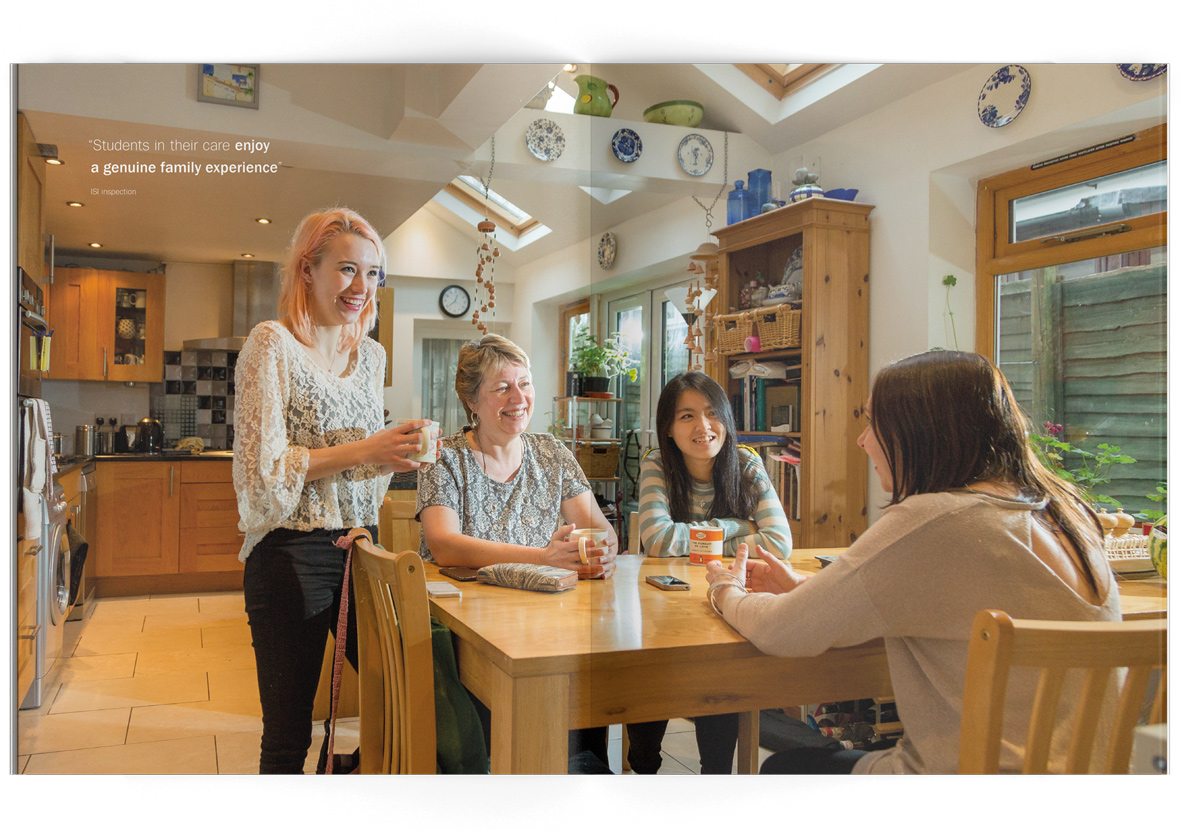
Following on from the success of the symbol we were asked to design a set of prospectuses. These large sized brochures have real impact, featuring stunning photography that captures the real essence of d’Overbroeck’s.


Featured projects
Interested in working with us?
Then get in touch as we'd love to hear your story

Contact

01993 813705 web@franksandfranks.com
Franks + Franks, The Studio, 9 Apsley Road, Oxford, Oxfordshire, OX2 7QX
