


Winchester House School
Winchester House School is a prep & pre-prep school for boys & girls on the borders of Northamptonshire, Oxfordshire and Buckinghamshire.
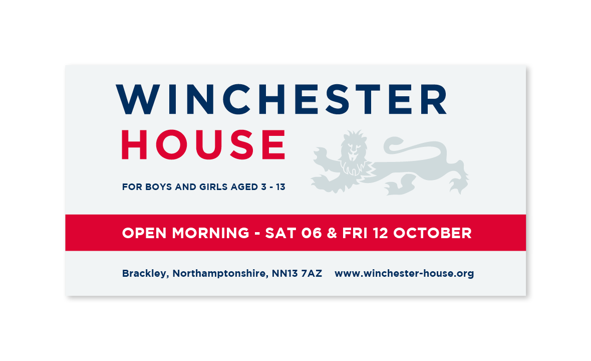
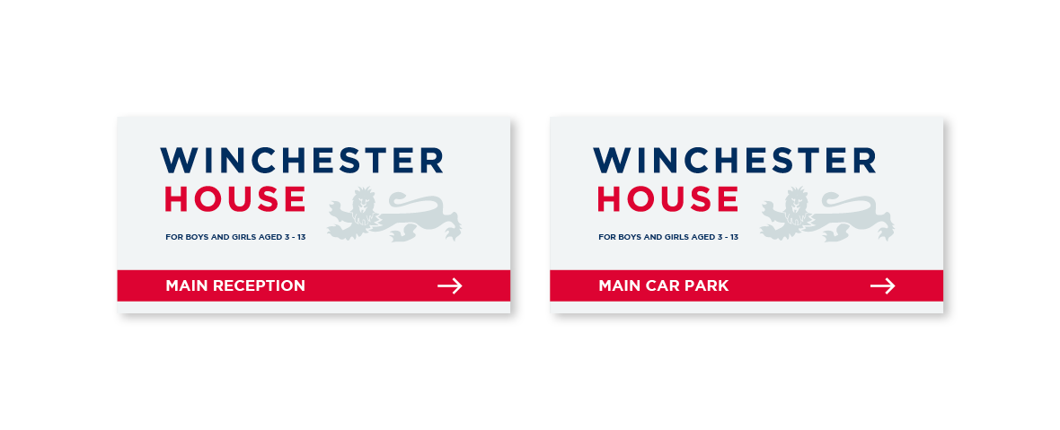
We designed their new logo - updating it to reflect their forward-thinking positioning in a competitive field and create standout both digitally and across printed media.
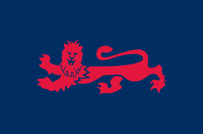
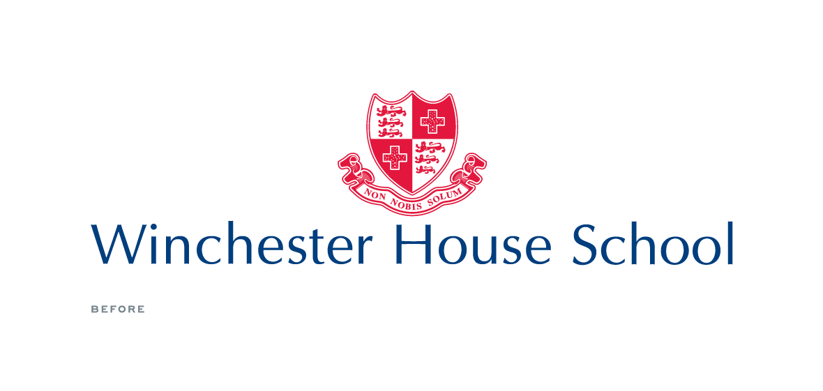
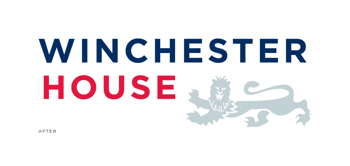
The old crest featured 3 lions but the school had already chosen to use a single lion on their school uniform / sweatshirt. So it was a logical move to formally adopt the use of this single lion as the symbol and drop the full crest. As part of this exercise we redrew the lion to improve various aspects especially the lion’s head and mane.
A new namestyle using the sans serif bold typeface, Gotham, was designed with a combination of a new stronger blue and brighter red. The logo incorporates the lion in a soft grey to complement the namestyle. The lion fits within the space created by the short and long name and neatly creates a strong, regular rectangular shaped logo which is easy to use across all platforms creating brand consistency.
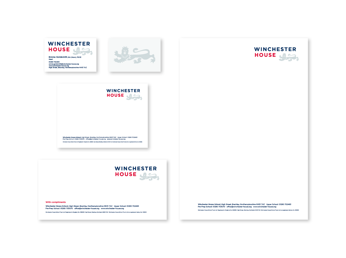
The lion on its own can be used in any of the new colours. We designed a full set of guidelines to help the school implement the logo over all items; signs, literature, website electronic templates and social media.


Featured projects
Interested in working with us?
Then get in touch as we'd love to hear your story

Contact

01993 813705 web@franksandfranks.com
Franks + Franks, The Studio, 9 Apsley Road, Oxford, Oxfordshire, OX2 7QX
